Independent Immigration for Everyone
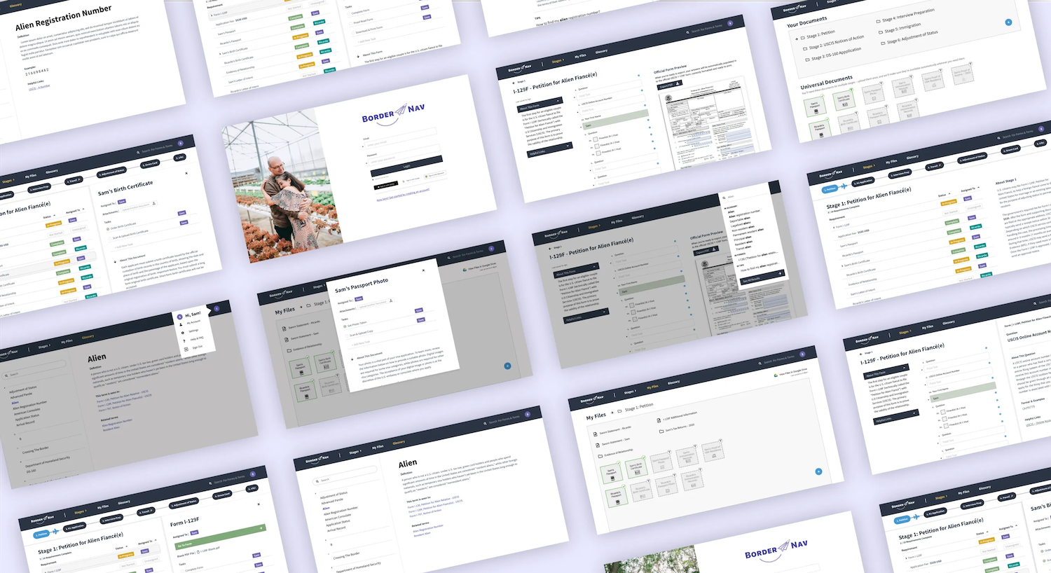

BorderNav is a web app that helps couples confidently navigate their application for a K1 U.S. Visa, which permits foreign partners to immigrate, then marry and live with their partners in the United States. The application process is lengthy, complicated, and expensive. Existing tools like visa processing services or immigration lawyers add significant additional cost.
Our users needed a better understanding of the time commitment, money, and requirements of the process, but indicated they could manage the application without hiring extra help if they had the right resources. Even if they chose to hire a lawyer, they said they would still benefit from a tool that helps them stay organized and track their progress. With a combination of document management and in-context, relevant guidance, BorderNav gives couples a way to collaborate on, organize, track, and complete their K1 Visa application with confidence and accuracy.
Project Context
BorderNav was designed by a team of four graduate students for a course in User-Centered Design in the University of Washington’s Human Centered Design and Engineering program, in Autumn 2020. The 10-week course introduced students to design research methods, user centered design principles, prototyping, and user testing. All interviews, co-design sessions, presentations, and critiques were conducted via Zoom and in Figma. We used Qualtrics to gather and analyze quantitative and qualitative data, and Mural for collaborative white boarding.
This project was a collaborative effort between Amanda Chen, Anna Trakhman, Eva Schipper, and Shengzhi Wang.
User Research & Gathering Information
We began by conducting a survey to better understand the range of experiences people have when applying for the K-1 visa. From 103 valid responses, we learned:
- Applicants had unrealistic expectations about timelines because they lacked information. 63% of respondents thought it was going to take between 6 months and 1 year to complete the entire process, but 68% of respondents said it took them longer than 1 year to receive their decision.
- Uncertainty about timelines had a negative impact on
applicants’ emotions. The top three
reported emotions when starting the process are excited,
hopeful, and overwhelmed. After they begin the process, their
emotions change to being disappointed, frustrated, and worried.
“ I am frustrated with the information out there and how difficult it can be to find. It’s been a roller coaster of emotions while waiting for answers”
- Applicants almost always use online resources, even if they hire legal help. Only 23% of respondents used paid legal help, and half of them used additional sources of guidance. Even with extra resources, people are still likely to do some work on their own.
Interviews & Affinity Diagramming
We developed a semi-structured interview based on the survey responses, and conducted 11 interviews with people at different stages in the process. We synthesized the results with an affinity diagramming exercise, sorting key insights into categories for common sentiments. The results both validated our insights from the survey and provided new ones:
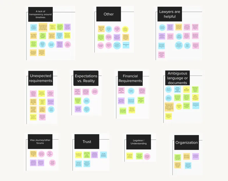
- Everyone felt positive about lawyers because they could be trusted to interpret the legalese on the application forms.
- Online resources are poorly written, often outdated, and contradictory, which makes people doubt their ability to complete the forms themselves.
- Users had lots of questions about specific requirements and the scope of
documentation required to support their application.
“We were confused when different sources had differing answers to our questions”
- Unexpected costs make the process even more stressful, and they happen often during the K1 Visa journey.
Personas & Design Requirements
With the insights from our survey, interviews, and affinity diagramming, we identified two personas who would use our product — Second-Guessing Sam, and Go-It-Alone Garrett.

Based on the needs of Sam and Garrett, we developed a set of core design requirements to guide our decision making. Our tool must:
- Provide accurate and up-to-date information about the U.S. Marriage Visa application process.
- Allow users to document the steps and progress of their application.
- Allow partners to share information and documents between devices.
- Explain and provide examples of application materials and answers.
- Inform users of documents and information needed well in advance.
Ideation & Sketching
Independently, team members generated several low-fidelity sketches and wireframes that might meet our design requirements and fulfill our users’ needs. Collectively, we reviewed and critiqued the sketches based on the ability to fulfill the design requirements and novelty. Three core features emerged: a user-friendly and informative form interface, a file manager to have the right documents at the right time, and an auto-filling system for frequently requested information like full names, addresses, and registration numbers.
“Something to help [me] understand the entire process at the outset would be key!”
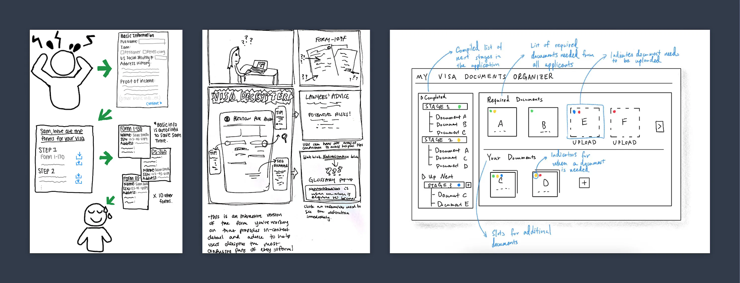
Through storyboards, we explored scenarios Sam and Garret might find themselves in, and how BorderNav could help them.
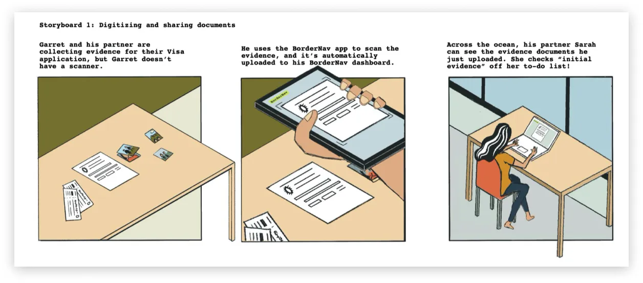
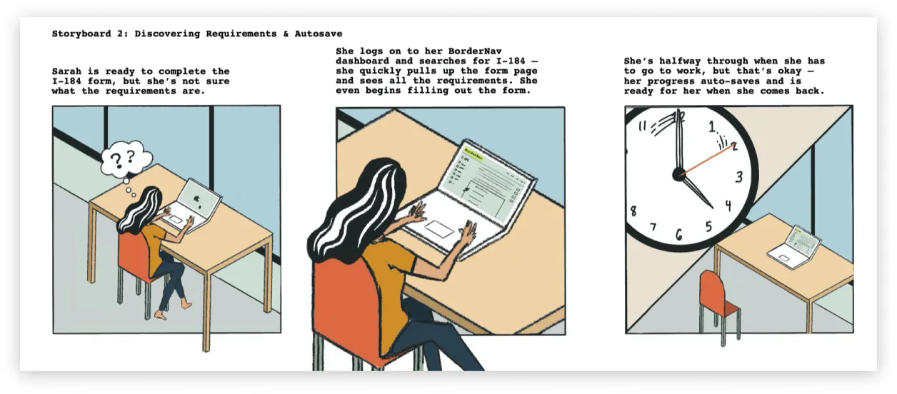
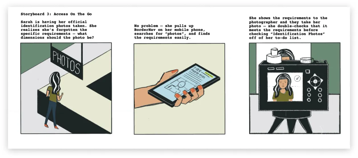
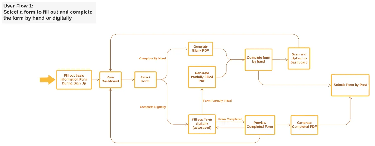
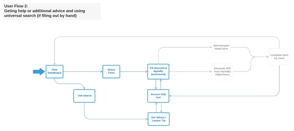
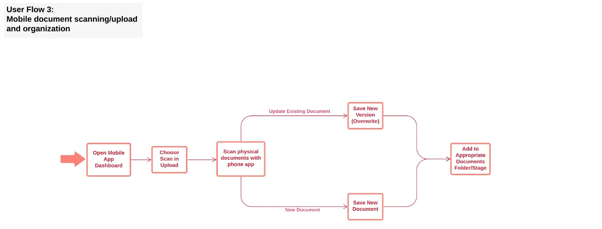
To begin designing features, we elaborated on the storyboards with user flows for each scenario. At this point, we decided to omit the “on-the-go” mobile scenario to keep the scope within what was possible for this assignment.
Information Architecture & Feature Evolution
With an understanding of who our users were and what they aimed to do, we defined 3 core features plus supporting pages that would help them get organized and feel confident in their ability to accurately complete their applications. Our initial information architecture looked like this:
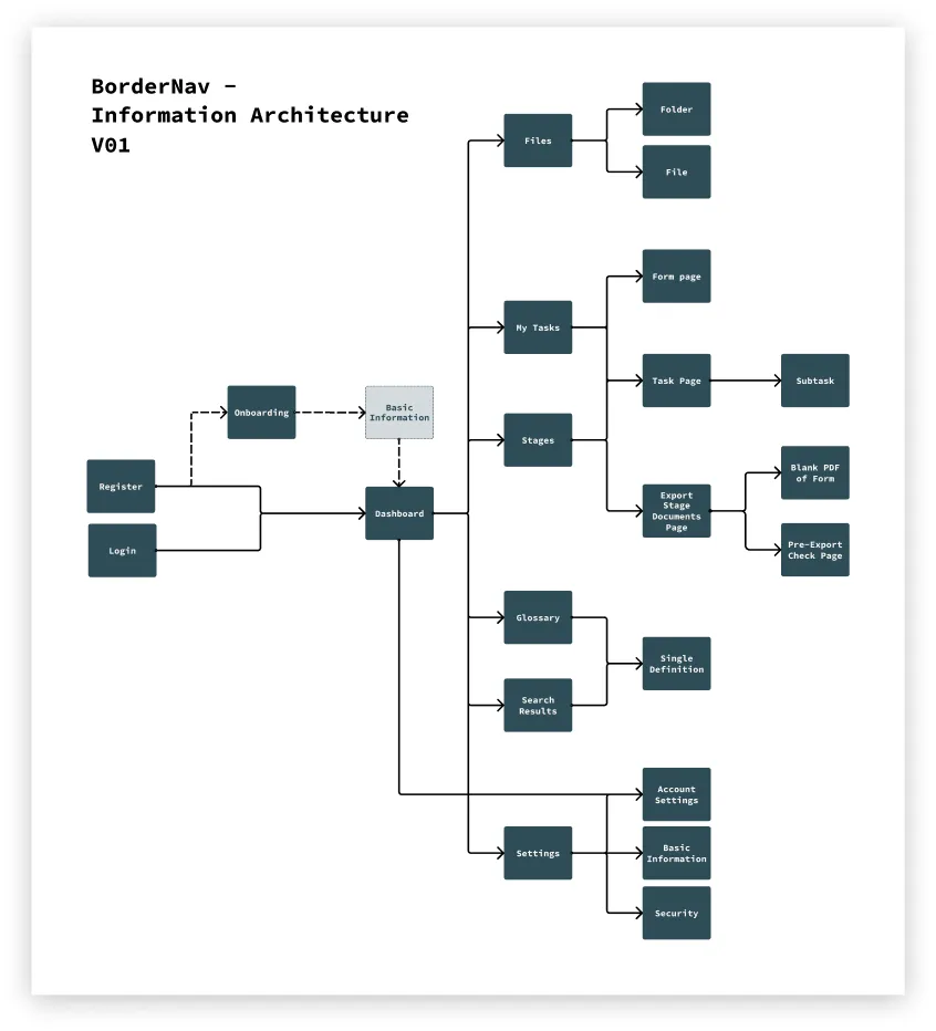
As we designed and tested our interface, our features went through a series of changes based on feedback.
Core Feature: Stages & Progress Tracking
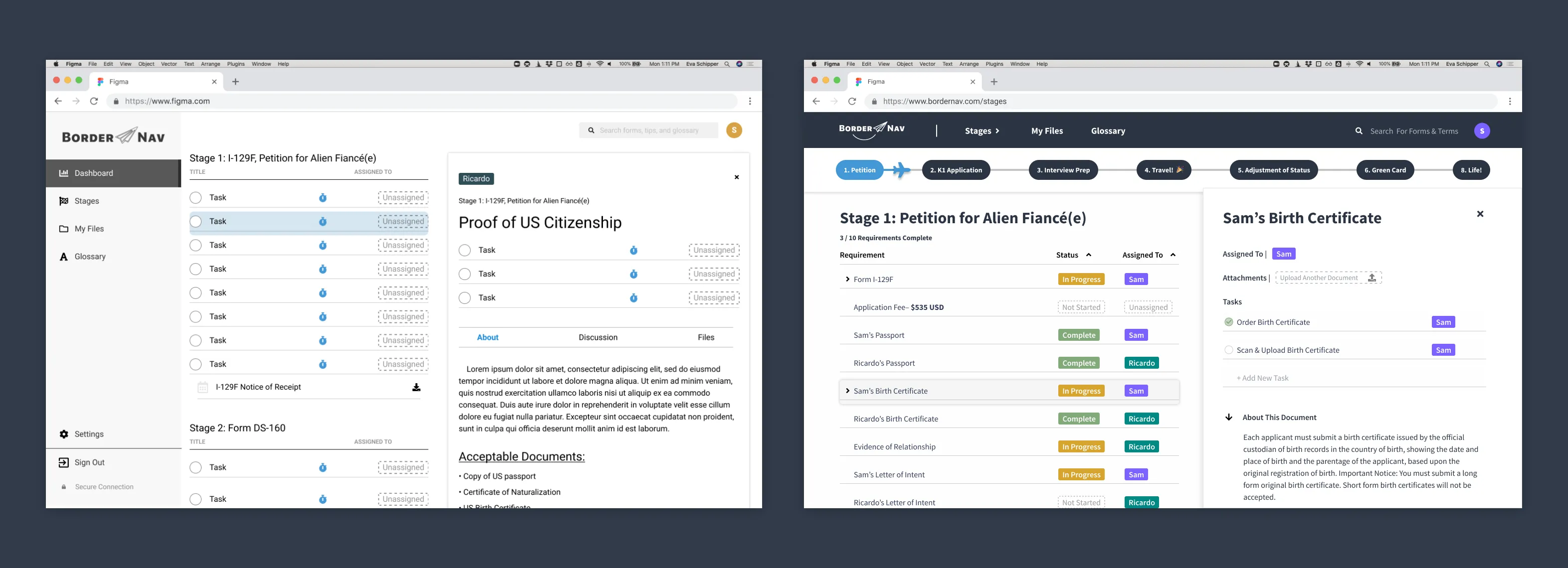
This is where users can see how far along they are in the process, and what they have to do to move forward. The built-in requirements like “Copy of Passport” define what is essential for the application, and users can add sub-tasks to fulfill those requirements.
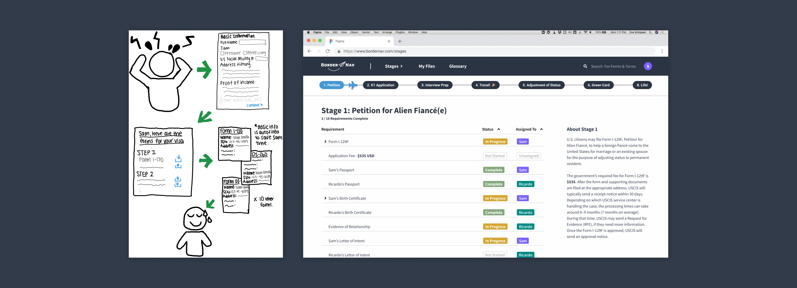
Our initial information architecture and design included a dashboard that housed a to-do list, a progress bar, and notifications about upcoming tasks and their partner’s progress. In testing, users were overwhelmed by the amount of information and lack of clarity. They also commented on its redundancy, because all the important tasks and timelines were available on the “Stages” page as well as the dashboard. To eliminate feature duplication and provide a clearer overview of the application process, we eliminated the dashboard and incorporated the peripheral components like notifications into other UI elements and made a revised stages view our home screen.
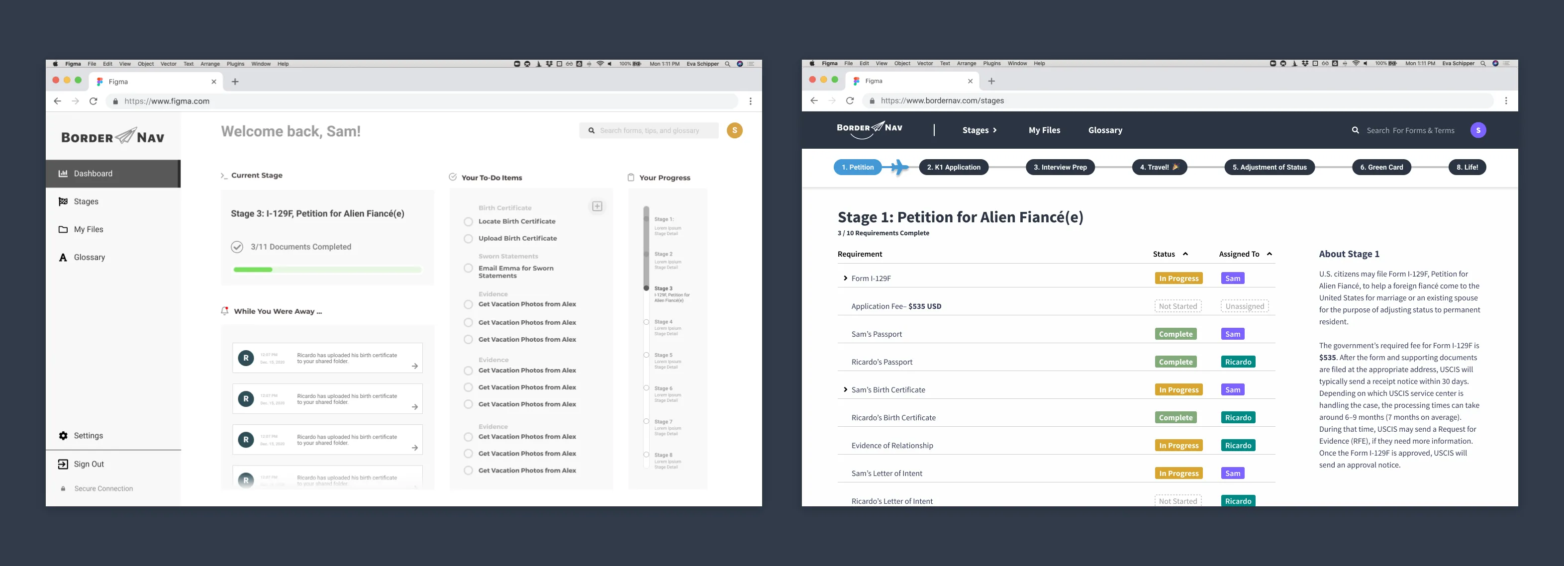
In our interviews and testing, we received universally positive feedback about the concept of a progress bar, but confusion about how it appeared on the dashboard. When we eliminated the dashboard, we placed the progress bar at the top of the homepage as a way to browse the stages as well as check progress at a glance.

The “Stages” view began as a checklist, but users reported confusion about whether or not they had to add tasks themselves, and why they couldn’t be checked off automatically when all the sub-tasks were complete. We made subtasks more flexible so users could customize their steps, and completed the requirements automatically when subtasks were all complete.
“If I didn’t have a lawyer having various checklists prior to submitting forms, apps, interviews, etc. it would be useful for every step”
Core Feature: File Management
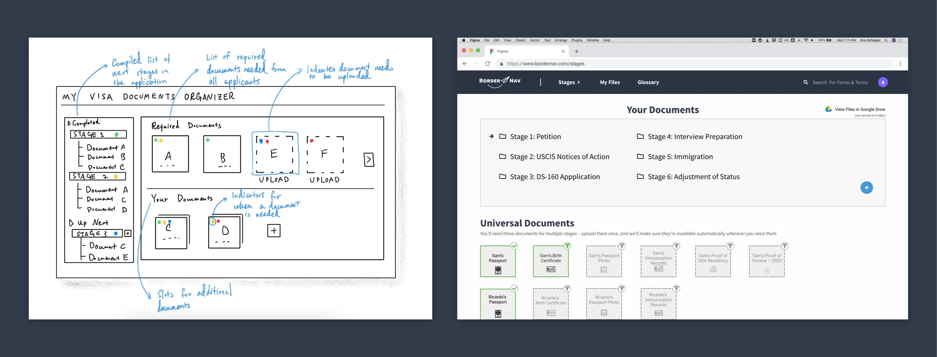
This is where users can store and keep track of all the forms, documents, and supporting evidence required to apply at each stage. Files was originally organized in two sections: “Core Documents” and additional custom folders. In testing, users did not understand the phrase “core documents” and thought it meant the rest of the documents were optional.
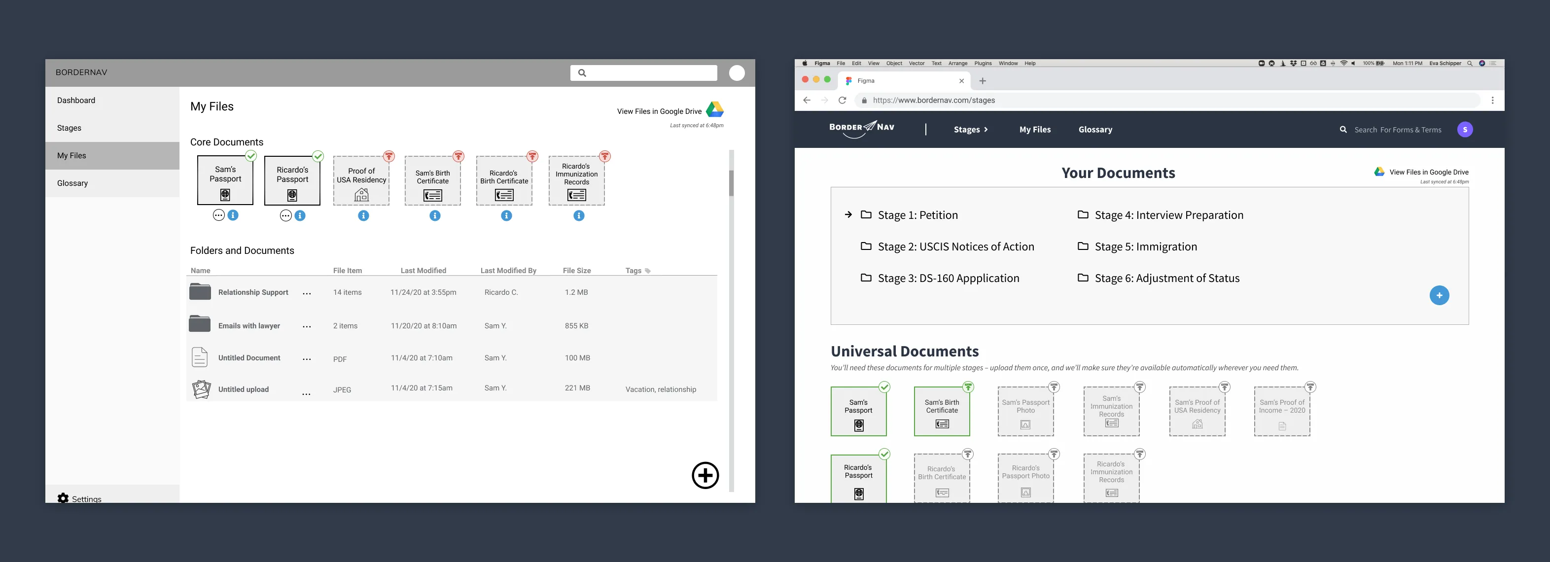
We updated the “Core Documents” to be “Universal Documents” with a short explanation of their purpose. Universal documents, like a copy of a passport, can be uploaded once as a “source of truth” and automatically filled wherever it is required. Universal documents are also tied to their glossary definitions, which provides additional information about the document when the user clicks through. Since the universal documents can be uploaded once and then left alone, the new interface prioritized the folder system for supporting documents, organized by steps.
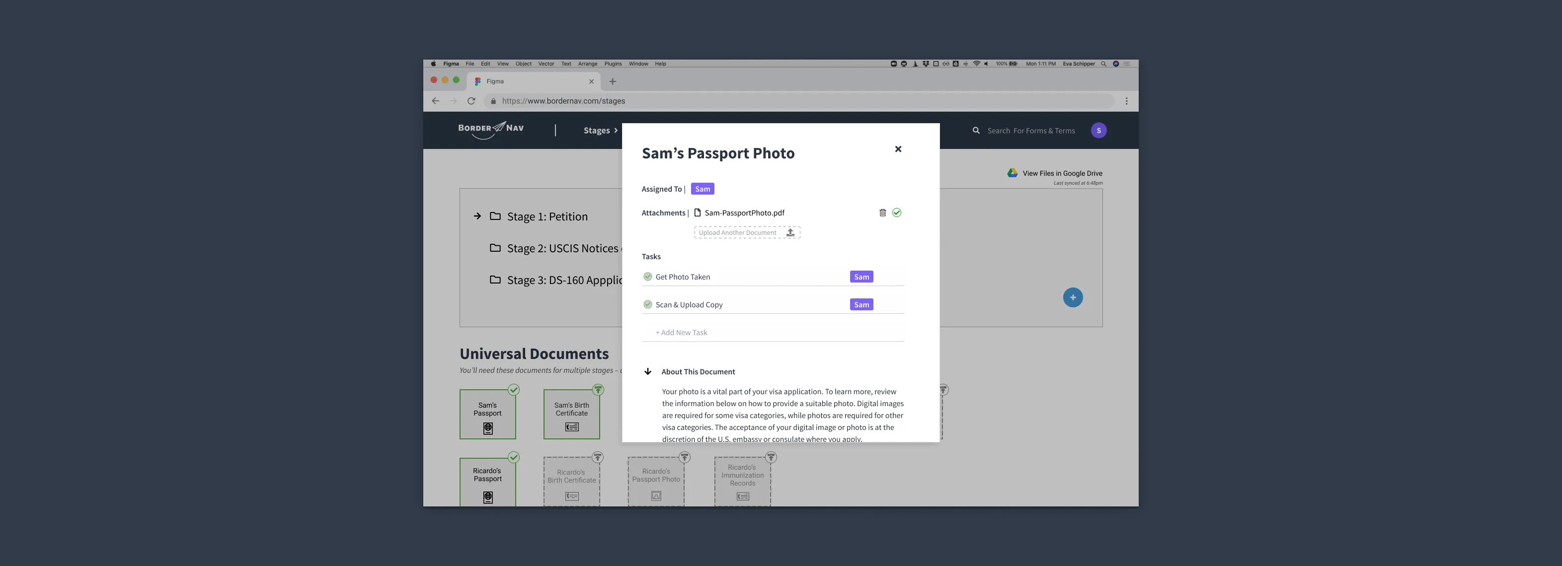
We initially incorporated third-party cloud storage through Google Drive (inspired by PDF Export), but our testers had conflicting views about this — some reported feeling assured by it, and others reported that it made them nervous because these documents were supposed to be confidential. Our final feature allows users to opt in or opt out of this feature during onboarding.

Core Feature: Glossary & Guidance
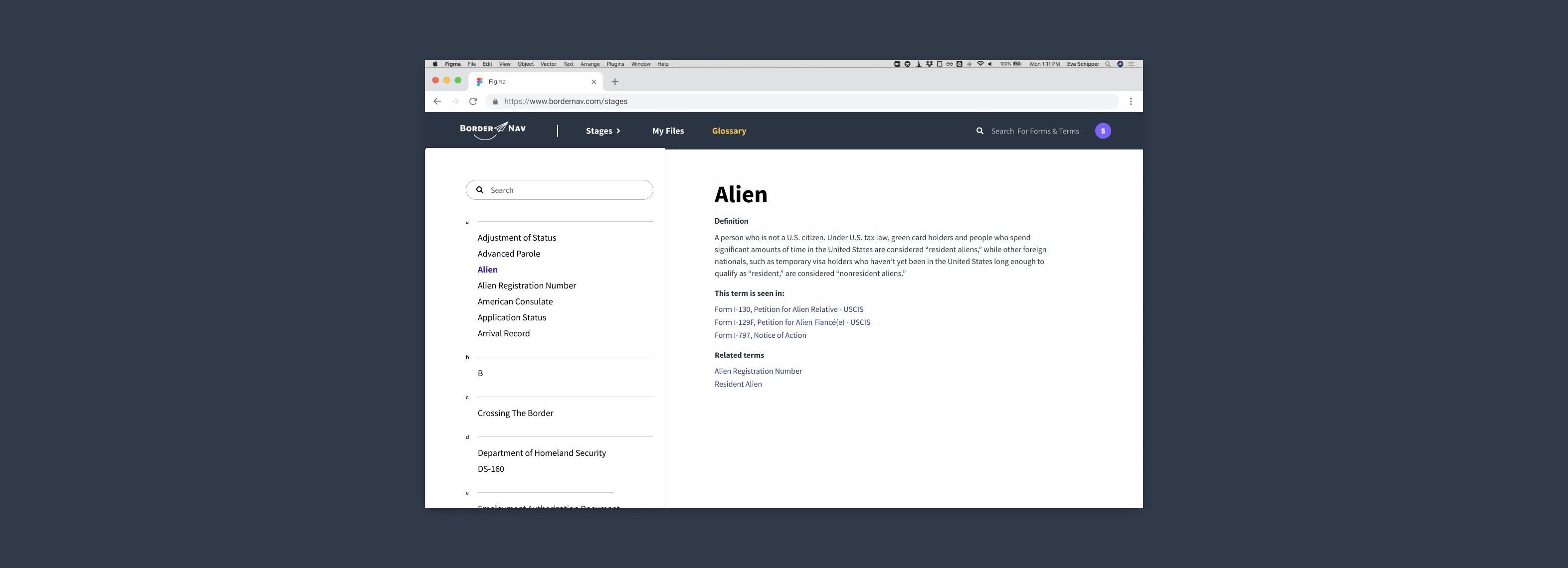
The glossary and guidance database holds information about terms, phrases, and requirements relevant to the application. The United States Citizenship and Immigration Services (USCIS) forms use legal jargon that users may not be familiar with, and it takes time and effort to scour the internet to find trustworthy information. In the glossary, users can search for a term or scroll through the alphabetical list. Each term has a “term is seen in” section, and a related terms list. Where appropriate, terms have an example for their format, and helpful links to official sources of further information.
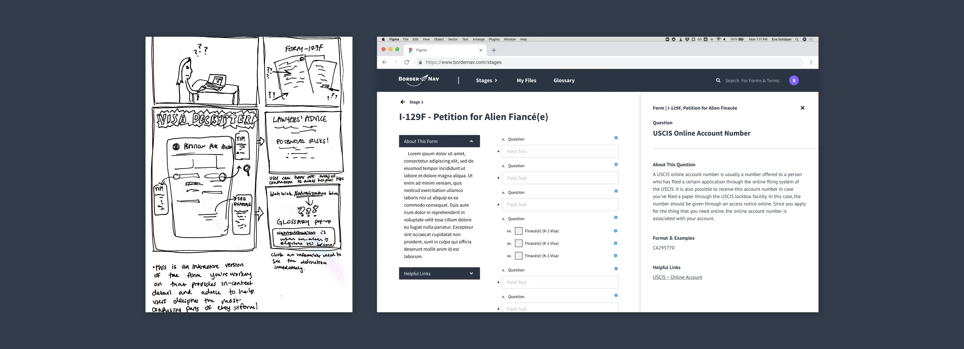
Information about glossary words is also available anywhere that word appears on forms and instructions, where relevant. Users can access the same information that exists in the glossary inline as they are completing requirements without switching pages.
BorderNav was a learning experience!
Navigating a marriage-based visa presents a plethora of challenges and we were able to connect with dozens of people who had undergone this process and were eager to share their experiences with us. In turn, we felt engaged and excited to build a product that addressed their needs, frustrations, and goals to make the process a little bit easier.
Our greatest challenges during this project were:
- Finding one on one interview participants in a short time frame. We reached out on Facebook groups for visa applicants and used word-of-mouth to identify people who might be willing to speak to us
- Understanding users needs. We practiced using neutral language and probing deeper into peoples’ experiences to better understand their situations
- Making decisions on the scope of the project. We reminded ourselves that we had key deliverables each week, and that we couldn’t solve every problem, but we could try to solve the biggest pain points we heard from our interviewees
- Thorough testing and reiterating designs. We tested our design concepts on classmates and interviewees to guide our decisions, and referenced established design principles and heuristics to aid our decision-making

